


The Problem
Imagine a busy mom juggling multiple tasks who finds it difficult to teach her children about big feelings. This is where our app steps in to make her life easier.
Our team designed this parental dashboard to inform parents about their children's progress and struggles while interacting on our educational platform.
Context
Luvbug Learning as ed-tech startup that aims to provide a platform for children to improve their social-emotional skills. At the same time, it helps parents support their children in understanding their own emotions better.
After the initial launch, the product failed to convert as many users as expected, So we investigated the issue to address the necessary changes.

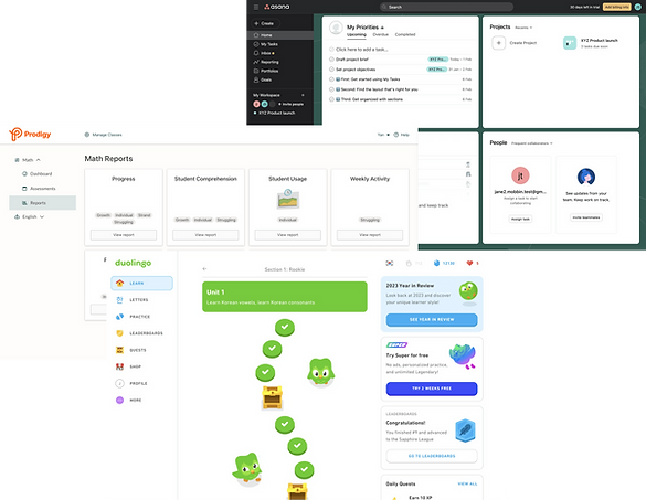
BEFORE

AFTER
Project Impact
-
Reduced customer churn rate by 15% by redesigning and launching features.
-
The number of monthly active users increased by 22%.
-
Created a design system and component library to facilitate seamless design handoff and improved development efficiency.
Explorations & Research
We wanted to address why we failed to convert target users. This included interviewing 8 parents to understand how they would track kids' progress and growth. Some key questions include:
These are some of our high-level findings:
Parents want to ...
-
see children's progress and achievement over time.
-
see performance insights.
-
have the ability to customize the learning journey.
What do you look for to know if the child understands the material?
Which part do you find the most difficult in teaching kids about their feelings?
Design prompt
How might we design a dashboard that helps parents monitor their child’s social-emotional well-being in real-time to reduce parental anxiety and improve child support
Moderate User testing
Understand user's mental model and current design gaps

User feedbacks
Turning users' needs into potential features


Challenge we met
How to layout elements to maximize users understanding?

One of the challenges is that it is a complex product with terminology and infographics that wouldn't be apparent to a new user immediately. They need to be learned.
It was crucial to educate the user and demonstrate the product's value without overwhelming or confusing them through the design.
So I refined the skeleton of the product based on the design principles.
S
Card Sorting Activity
Ask users to rank the top 5 features they find the most helpful

I simplified the Information Architecture and ensured the data stands meaningful and insightful.
I surveyed users to rank the top 5 features they find the most helpful then I prioritized these features in the hierarchy

Identified Issues
The product's terminology and layout cause confusion, requiring extra effort for users to learn.
I performed competitor analysis to ensure external consistency with other digital dashboard products.
Modular design is widely adopted because it reduces friction when users need to understand the function of different areas.

Visual Solution
Align designs with users' mental models to reduce friction and enhance learnability.
Design Direction
Reduce visual distractions while supporting parents to stay connected to their child's progress.
In this version, I used greyscale to enhance information efficiency before adding colour to the design.


Here is some feedback we find insightful:
-
"I feel the data of questions and correctness in the calendar aren't insightful enough to determine how I can help my child next."
-
"It's time-consuming when I want to see which questions my child got wrong ."
-
The page contains many data and I don't know where to look first.
Optimize UI elements to effective communicate the information
-
Created the achievement overview panel for parents to decide which section they want to see in detail.
-
Added filtering options allowed users to narrow the data set before visualizing it.

What we delievered
Effectively communicating children's mood levels, addresses the core changes
Parents can track their child's mood patterns, gaining valuable insights into their emotional state and offering guidance during challenging moments.
Individual Progress Report
It allows parents to navigate the course content, track their progress, and see where the course is currently active.

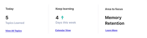
An overview of all the activities and progress made by a child.
Provide real-time insights into the current state of important metrics for a child.
View upcoming, completed, and incomplete activities along with detailed breakdowns.

Next Steps
A Dashboard for Teachers
We plan to create a dashboard for teachers, including reviewing/creating lesson plans, getting class/individual performance analysis and updating reports in real-time.
Due to a non-disclosure agreement with LuvBug Learning, I am limited in showing the rest of the application and mockups, as they contain sensitive information and architecture.
If you'd like more information, feel free to contact me at kadencezhu@gmail.com.


