OVERVIEW
Renta is a mobile app that enables users to rent cars online. This app aims to streamline car rental services in rental car mechanic transparency and reduce friction associated with car pick-up.
I designed this app based on my personal frustrations with the rental car experience. In this project, my role was a UX researcher, UI designer and strategist.
PROBLEM
Renting a car has always involved Complex booking processes and can be time-consuming to pick up and drop off the car. Users might also lack confidence in the car's condition during the trip.
Design prompt
How we can better help users to monitor and manage their car rental experience?
USER INTERVIEW
By conducting user research, I interviewed 10 people and identified three main concerns in their experience.
“
I often find myself spending a considerable amount of time weighing the best options for my trip. Additionally, the staff frequently attempts to persuade me to choose more costly options that would benefit them the most.
I had no idea how many cars were in the pickup garage. It's confusing to locate my car with only the parking spot number to go by.
When going on a long trip, I prefer to keep tabs on a vehicle that is consistently well-maintained. This way, any unforeseen circumstances that may disrupt my plans won't be a concern.
USER RESEARCH
Through a synthesis, I was able to create a journey map to visualize the steps users take when engaging with relevant services. This aided in the identification of motivations and pain points throughout the process.

RESEARCH FINDINGS
These insights aligned with the issues I had noticed in my own experiences with car rentals. Keeping these insights in mind, I contemplated how might we translate these pain points into design solutions.

PRODUCT GOAL
To simplify the rental process and eliminate the need for paperwork by developing a platform that integrates contract signing, car selection, and speedy car pickup without requiring a visit to the rental office.
INFORMATION ARCHITECTURE

LOW-FI WIREFRAMES


VISUAL DESIGN

KEY FEATURES

Efficient Search Flow
Designed for a speedy rental experience, the app assists users in locating a rental spot close to their location and simplifies the rental process by providing a calendar and filters to streamline the search.

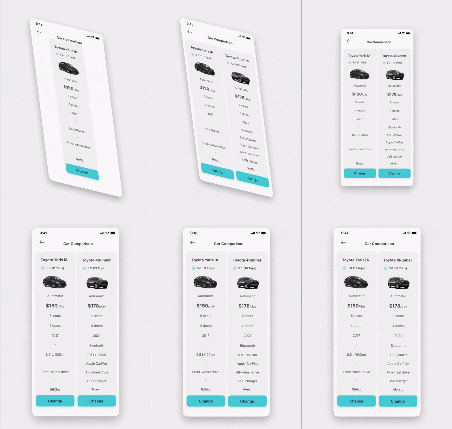
Easy Comparison
A side-by-side comparison feature makes decision-making easier and faster!
This feature allows users to add desired vehicles to the comparison page, where an intuitive feature chart will emerge, saving users time and avoiding the hassle of navigating across multiple pages.


Digital Document Submission
Users upload and verify IDs, licenses, and payment details in-app, eliminating front-desk delays.
Self-Pickup with Remote Unlock
-
Upon arrival, users enter a unique code (sent via email) to unlock their car—no waiting in line.
-
Users can trigger lights/horn from the app to locate their vehicle in large garages.


Remote Control & Status Dashboard
To ensure a safer and more informed travel experience.
Users can monitor tire pressure, fuel levels, battery status, and engine health in real-time to feel more confident about their trip.

REFLECTION
Although the project has made progress, several features have yet to be implemented due to time constraints. The current design has considerable scope for improvement, and further research is required to explore certain possibilities.
Through extensive research, I have identified common issues and frustrations people experience during car rental. I am confident that developing a mobile platform will provide significant benefits to users.


