

E-Learning
Platform Website Design
Role: UI/UX Designer
Category: Team Project
Responsibilities: UI Design, Wireframing, Prototyping
About LuvBug
LuvBug Learning is a Canadian Ed-Tech startup that provides resources for kids to regulate and understand their own emotions. LuvBug wants to present its product while ensuring branding that is playful, yet professional.
The problem
The company wants to build a visually compelling website that can prompt parents and caregivers to resonate with today's concerns about children's social-emotional skills.
What I did
My responsibility was to design the entire website from the first iteration to the final deliverable. The project objective is to create a design that is colourful, user-friendly, and legible. which would resonate with families who were looking for an intelligent solution to foster their children's emotional growth.
Result
Created a user-centric website introducing an e-learning platform, which increased user engagement by 50%, by utilizing iterative design processes and incorporating real user feedback.

Align on project goals,
communicate the UX approach
The business wanted to see the growth of visits and sales by presenting relevant data and stunning graphics from our play-based learning games on the website.
However, we think there should be a more user-centric and creative solution. So we aligned with the stakeholders on their goals and proposed how UX can get a more user-centered solution by exploring user needs and evaluating the task.

DISCOVER
What features would help inform parents' decision to join Luvbug?
I interviewed 3 parents who were concerned about their kid's Social-emotional skills. Here's what they had to say:
With the increasing reliance on digital devices and social media, I worry about the impact on my child and how age-appropriate those content are for my children's self-development.
"I worry that my child is struggling to manage their emotions, especially when faced with challenges or conflicts with peers. I want better guide them to develop coping strategies to navigate life's ups and downs."
I've noticed that my child experiences difficulty in understanding and expressing their emotions.
I want to empower them to feel confident in expressing themselves and seeking support whenever they need it.
Understand what Parents and
Caregivers looking for in the market.
I worked with my team to answer the questions that are crucial to examining the experience and delivering solutions. We synthesized insights from user interviews.

User Research Takeaway
It's important to keep in mind their needs and expectations. As the result of the interview. I translate parents' needs into our Three Defining Pillars. There are:
-
Content designed for different age groups
-
Educational videos for Kids
-
Parenting Materials
Define
Sitemap
I created this sitemap to define the basic skeleton of LuvBug's website. I sorted the website into 5 sections. Translating user needs and product objectives into specific requirements for what content and functionality the product will offer to users.

Design
Low-fidelity Wireframes
Collaboratively, my teammates and I utilized the information architecture diagram as a blueprint to construct wireframes.


Iteratate Process
By applying some styles to the lo-fi wireframes, I was able to better communicate with the team about the website's look and feel, gather feedback and quickly make changes based on the stakeholder's feedback.


Interaction Design
As a requirement from the stakeholders, The team wanted to create a more immersive and playful user experience when the user first lands on the page. I then came up with a few versions of micro interactions within the design.

Version 1
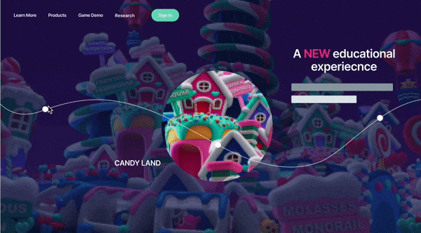
Version 2
Version 3
High-Fi Wireframe


I collaborated with a Marketing Coordinator to develop compelling copy that communicates diverse value propositions for signing up for Social-Emotion Learning and Luvbug products.
Internal Testing
After completing the initial design draft, we proceeded with internal testing, and among the feedback received, one point stood out prominently:
Team members found that the dark theme did not reflect a family-friendly and playful brand to our target audience.
In response, The team decided to transition the layouts to a bright and clean design aesthetic.
Product Plan Page

Parental Pionter Page

Learn More page

Final Deliverable

Reflection:
Throughout this project, I recognized an opportunity to optimize our process. the collaboration between designers and developers wasn't as effective as desired. Typically, designers would share their designs with developers towards the project's conclusion, leading to inefficiencies and feature revisit.
To prevent this from happening in this project, I would consistently send my ideas to my engineers to assess feasibility and hear their thoughts. I also established a more formal last stage of the design process where design and engineering meet before closing out a project to evaluate the original design against what the engineer had built and QA the product together.
More to explore

E-commerce Website Redesign

Platform Onboarding

Revamping the car rental experience